Hi there. I’m a freshly-enrolled grad student at Texas Tech pursuing a master’s in technical communication. You can learn more about me on the About page.
The capstone project is creating a portfolio showcasing original work that demonstrates technical communication principles that I’ve learned from the program. Barely one class in, the first deliverable of a wireframe is already due.
Wireframe
Most websites can be broken into three fields:
- Header - at the top of the page like the site name/logo and navigation
- Body - the main content of the page and can include multiple sections
- Footer - at the end of the page like Copyright or other links
Grid-based card designs are in. They’re easy to code thanks to Flexbox, and symmetry is calming and clean. There’s no reason to reinvent the wheel, so I sketched out a simple grid layout:
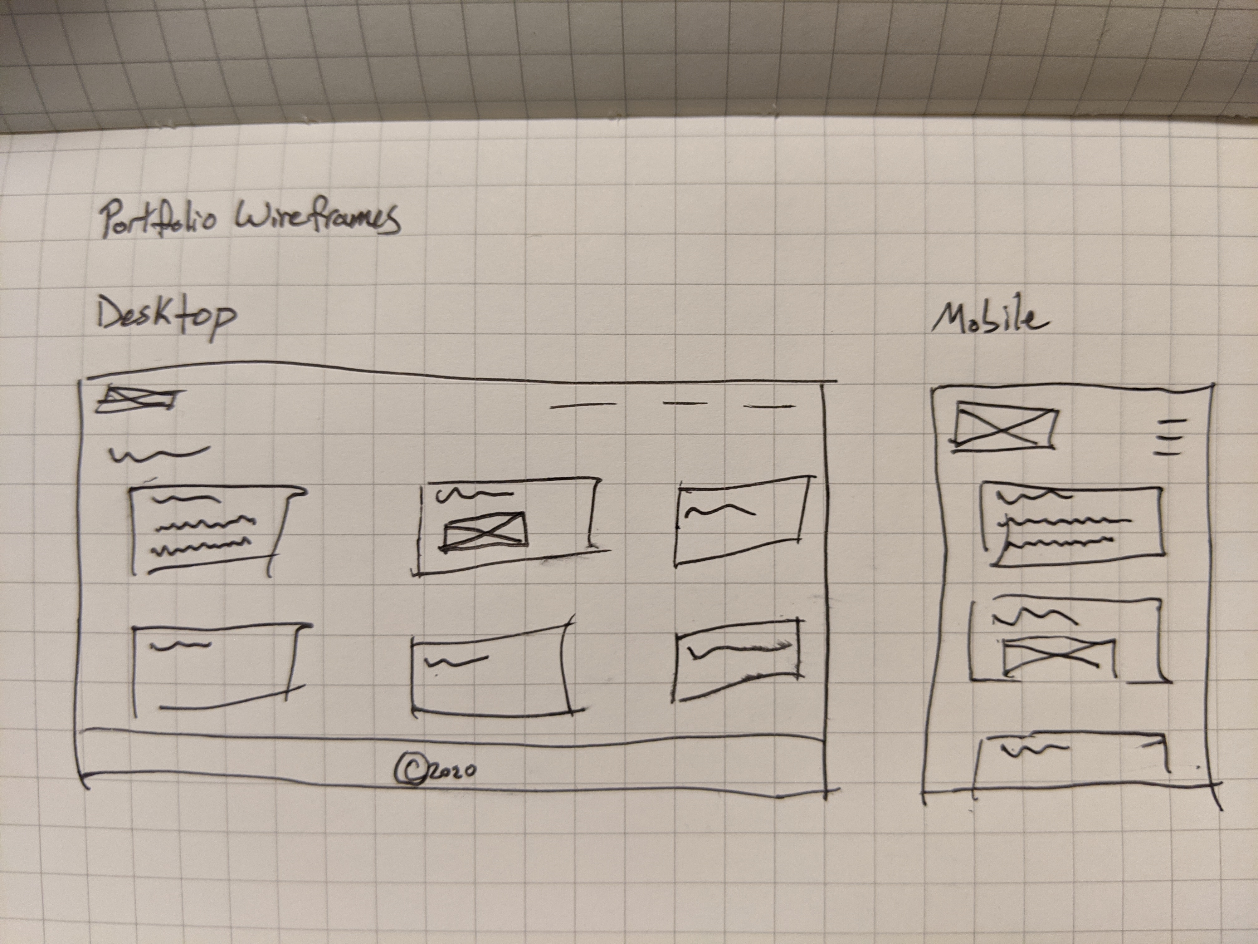
The top row consists of the logo (a box with an x indicates an image) and lines for the navigation. The navigation is truncated into a hamburger menu on the mobile wireframe. The next six rows for the desktop and seven for the mobile wireframe include the main body content. I sketched out different possibilities for project card designs including a title, descriptive text, and image. The last row on the desktop is the obligatory footer.
If I were hand coding this site, I’d then open up Sketch or Adobe XD to pixel peep the hell out of this wireframe to create a higher fidelity prototype, but if I’m not reinventing the wheel, I’m definitely not going to assemble the car.
Proof of concept
I was initially drawn to the Hugo Creative Portfolio Theme. While it’s yet another card design, I liked the asymmetry and the visual aesthetic. But since the majority of the work I see myself including in my portfolio is text based, I thought against it and ended up with this:
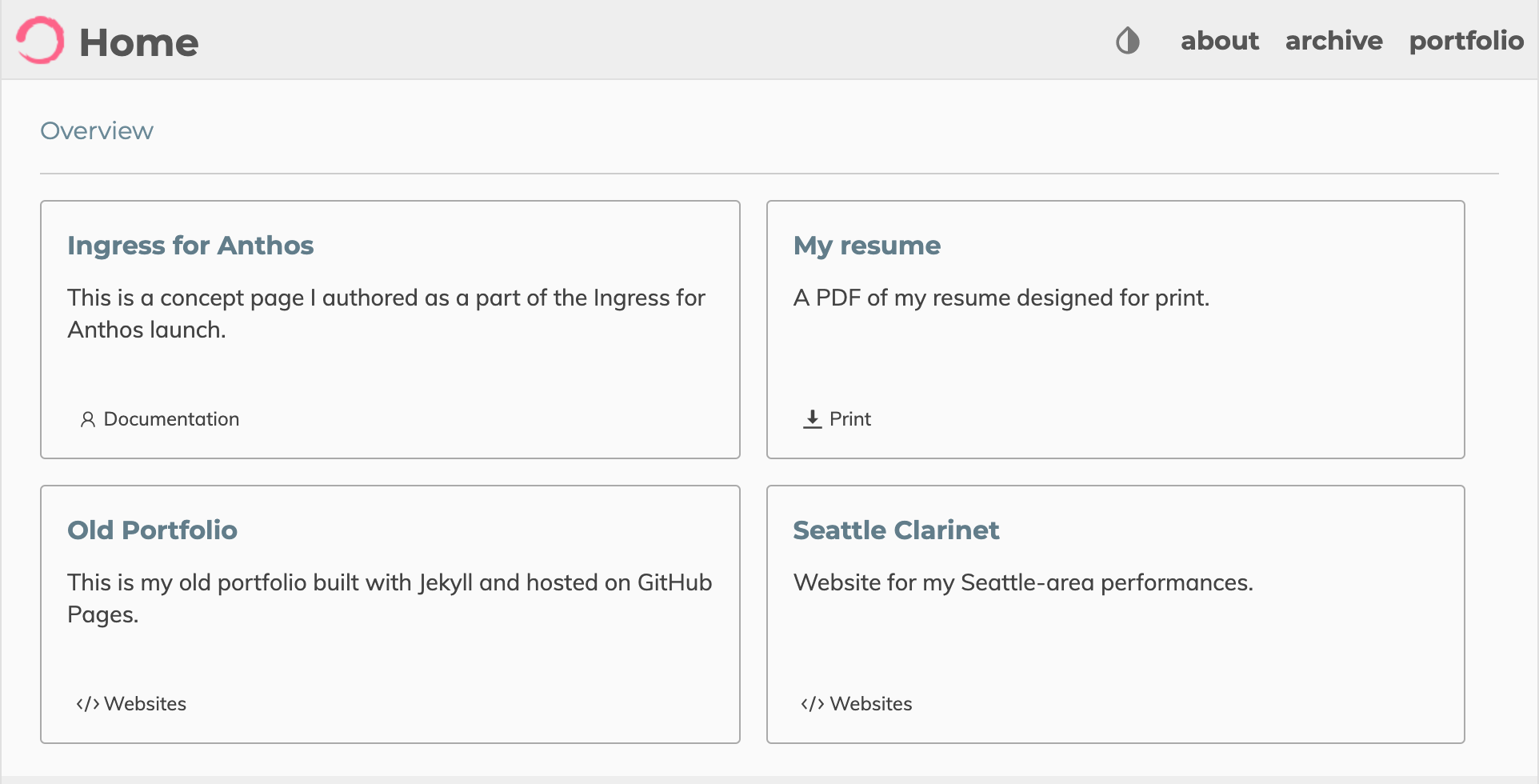
I have cards for each project and a title, description, and category for each card. Currently, three out of the four cards link to external websites and one links to a self-hosted PDF. I may have to add an additional page for each project to explain the rhetorical situation, technical communication principles, and any other portfolio requirements. I would also like to add functionality to add the option to sort by project category. And maybe optionally add images on the cards. And update the logo. Luckily, this is only the first iteration. I have years to polish this site and my portfolio pieces.
About this site
This is a Hugo site based on zzossig’s theme and hosted on a free tier Google Cloud Storage bucket that uses Cloudflare for a free SSL Certificate. There’s no CI/CD pipeline. I’m manually running a command to sync the site files to the storage bucket. If I end up needing continuous integration, I can just move from the Cloud Storage to Netlify. Actually, that could also be helpful for keeping live snapshots of old builds…
This is, admittedly, an over-engineered but FREE, well, excluding the cost for the domain, portfolio site. There are much simpler and user-friendly options like Adobe Portfolio, Squarespace, and countless others, but none of the good ones are free–Adobe Portfolio is “free” if you’re paying for Creative Cloud.
All that said, technical literacy is an important skill for technical communicators; it’s in the name. Being familiar with the industry tools (static site generators, cloud services, etc) can only help. Probably.